L1VE web platform · Case study
Designing the web experience for live VR events
L1VE is a live VR entertainment platform for sports, music and other events.
01 — From Web to VR
Making the transition into VR effortless
Users could purchase an event on the web, but moving from the website into the VR experience introduced unnecessary friction.
Before
- Website
- Email + password
- VR
Solution
- Website
- Pair device
- 6-digit code
- VR
- Watch
A pairing flow allowed users to authenticate their headset without typing credentials inside VR.
Pairing flow
- 1
Purchase
The event is bought on the web, where a keyboard exists.
- 2
Pair device
The handover starts on the side that already knows who you are.
- 3
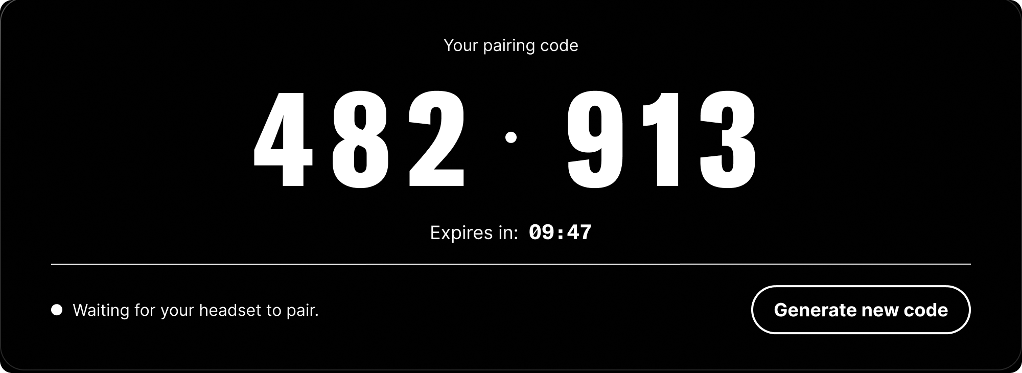
6-digit code
Six digits, and a ten-minute clock.
- 4
Put on headset
Nothing has been typed inside VR yet, and nothing will be.
- 5
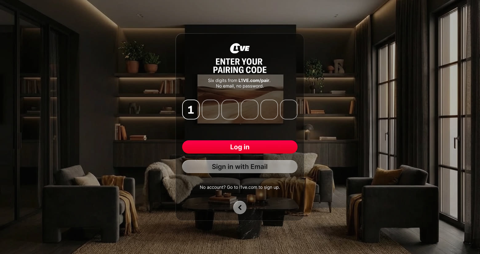
Enter code
Six fields. No email, no password.
- 6
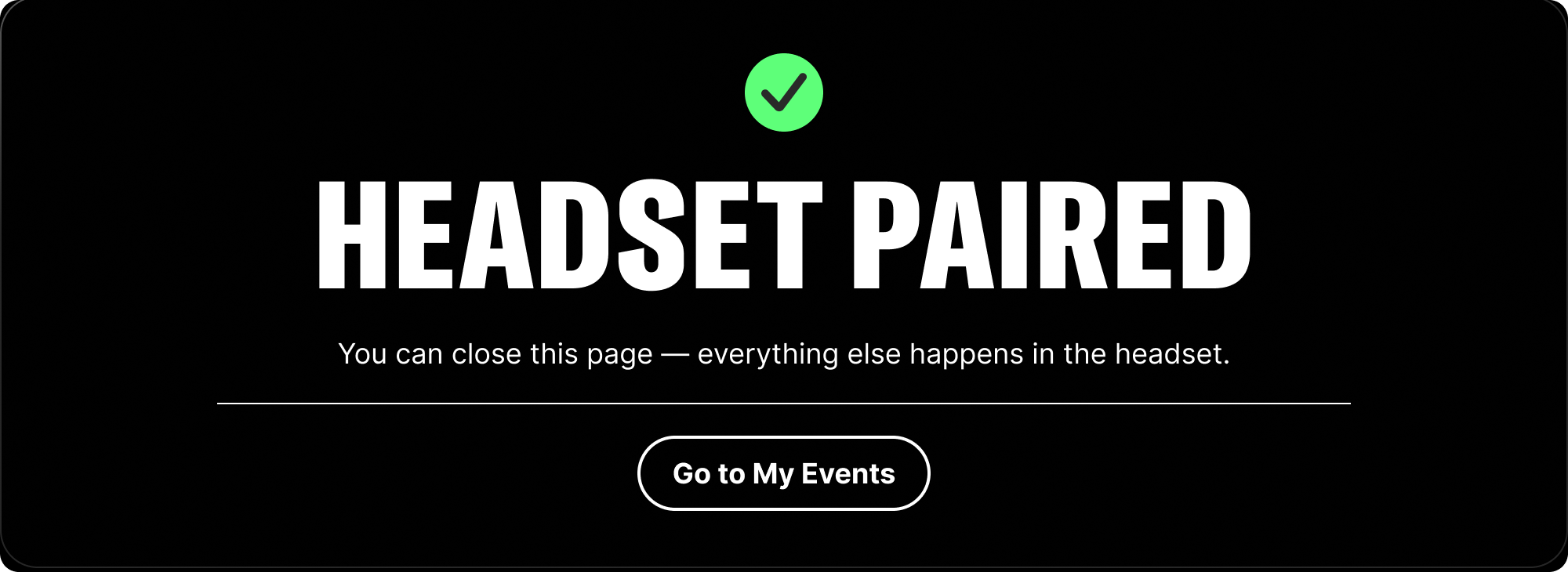
Connected
The headset confirms, and the page changes by itself.
Designed across
02 — From Single Events to Event Collections
Designing a new way to experience tournaments
L1VE originally focused on individual events. As the product expanded to collections such as tournaments, users needed a way to understand the relationship between multiple events.
Tournament page
- Tournament
- Overview
- Schedule
- Past
- Live
- Upcoming
- Purchase status
- Purchased
- Available
- Unavailable
The schedule became the central navigation layer between the tournament and its individual events.
Users can
03 — From Multiple Purchases to One Checkout
Identifying a gap in the purchasing experience
Once event collections were introduced, another limitation became apparent:
- Event ACheckout
- Event BCheckout
- Event CCheckout
- Event DCheckout
Multiple events meant multiple separate purchases.
Opportunity
- Event A
- Event B
- Event C
- Event D
I proposed a multi-event cart to consolidate purchases across individual events and tournaments.
Status
04 — Registration
Redesigning the path to purchase
The registration experience was redesigned to make the path from account creation to event purchase clearer and more engaging.
- Discover
- Register
- Choose event
- Purchase
- Pair device
- Watch
Designed for
05 — Building a scalable UI foundation
Turning a fragmented interface into a more consistent system
The redesign exposed inconsistencies across typography, components, responsive layouts and Figma files.
Before
- Multiple files
- Inconsistent styles
- Broken variants
- Detached components
What changed
- Typography
- Components
- Responsive UI
- Current designs
- Development
Typography — the styles
Typography — in the product
Shared styles
Components and variants
Contributed to
One source of truth
- WIP
- Current designs
- Ready for development
The team consolidated the website into one shared Figma source and introduced a clearer separation between exploration and approved designs.